Project Group 02 Axolotl Limb Regeneration, DS 4200 S22
Brian Huntley, Elliot Bangerter, Kelly Phalen
Service-Learning Course Project as part of Ds 4200 S22 Information Presentation & Visualization, taught by Prof. Cody Dunne, Data Visualization @ Khoury, Northeastern University.
Abstract
The focus of this project is on the change of gene expression levels throughout the regeneration process of a salamander limb. We have acquired a dataset from James Monaghan containing gene expression levels from 20,000 genes during the regeneration of axolotl limbs. The motivation behind this project is to create an interactive and queryable visualization that is easily digestive and demonstrates significant trends in changes in gene expression. We hope to make the data and information from James Monaghan’s studies easier to understand to progress the fields of animal homeostasis and regenerative medicine. Current visualizations for this data can be difficult to comprehend and explore since they are basic and lack a web-based or interactive component. We hope to aid scientists in their findings to further the knowledge about regenerative genes.
Data
This Excel file contains all of the data for James Monaghan's study published in 2017 titled, “Transcriptional correlates of proximal-distal identify and regeneration timing in axolotl limbs.” The first sheet contains all of the gene expression data from day 0 to day 28 post amputation of the axolotl upper arm. The following sheets contain the different clusters of genes grouped by similar gene expression trends throughout the 28 day study.
Axolotl Limb Regeneration Dataset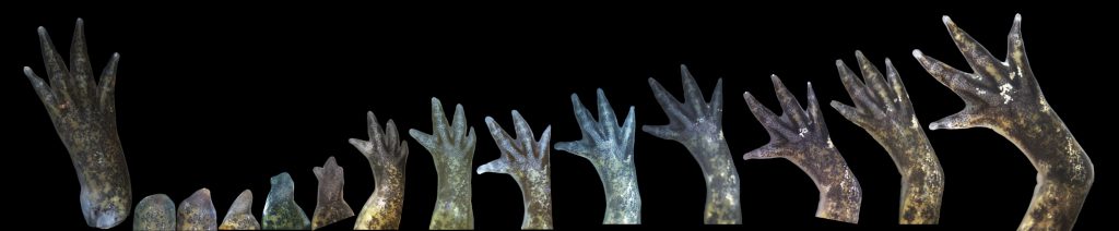
Visualization explanation
Select a point on the dot plot (volcano plot) that represents a singular axolotl gene that corresponds to a human gene.
The genes are arranged on the x axis based on their maximum change from the baseline day 0, prior to the removal of the limb. The y positions correspond to the mean gene expression as meadured for fluorescent probes.
Darker colors represent more of a change, with blue representing a negative change or a decrease in gene expression
and red representing a positive change or an increase in gene expression. To zoom in on a gene or areas of genes, brush the area,
and to zoom out, double click on the plot.
The volcano plot can be filtered using the dropdown menu in order to group the genes into 6 different clusters.
The genes within each cluster follow similar expression trends; the overall trend is displayed above the plot once
the cluster is selected.
When a point (gene) is selected, the corresponding line chart appears that shows the individual change in gene expression from
day 0 to day 28 post amputation. The axolotl and human genes as well as the log fold change in gene expression appear to the right.
A given axolotl gene can also be searched in the search bar, and its line chart will appear.
When a point is selected, it turns green in color. Then, when a different point is selected, the previously selected point
changes back to its original color and the newly selected point turns greens.
The heatmap is created by selecting a few different genes from the dot plot. Upon multiple selections of genes, the heatmap
grows to include the relations of all of those genes. The human gene is displayed on the left side of the heatmap and the
bottom displays the days since amputation. A gene of the heatmap can be removed by clicking on any box in that gene"s row.
Additionally, the heatmap can be reset by clicking the reset heatmap button located under the search bar.
Axolotl Limb Regeneration Presentation